Field note
Foil Stamping Versus Spot UV For Malaysian Brand Packaging: How To Choose
Compare foil stamping and spot UV for Malaysian packaging by visual contrast, touch, artwork fit, substrate compatibility and production risk.
Published 22/08/2026
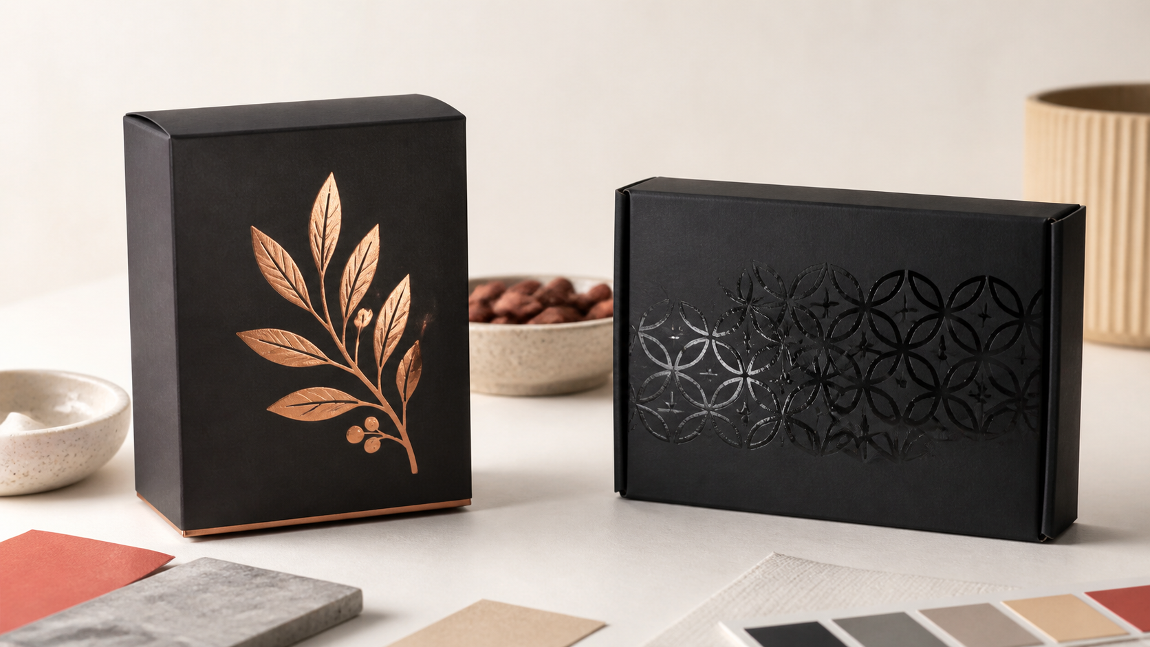
Foil and spot UV can both look premium in a screen mock-up, yet they fail in different ways on a finished pack. Malaysian brand owners, designers, marketing teams and packaging buyers should choose between them by comparing visual contrast, touch, artwork, substrate compatibility and production risk. Foil adds an opaque decorative layer, often metallic or strongly coloured. Spot UV keeps the printed design visible and adds selective gloss and surface contrast.
The quickest decision test is this: choose foil when the finish must look visually separate from the printed artwork; choose spot UV when the printed artwork should remain visible and become more noticeable through gloss. Neither finish guarantees a premium result. Material compatibility, artwork restraint, registration and production consistency matter more than the name of the technique.
Key takeaway: Decide what kind of contrast the pack needs before discussing production methods. Then approve that effect on the intended substrate, with the intended print and lamination, as a converted physical sample.
This guide compares visual contrast, touch, artwork suitability, substrate interaction, file preparation and quality-control criteria. It is designed to help buyers prepare a clearer specification before requesting comparable proposals from Malaysian converters.
How The Two Decorative Processes Work
Foil Uses Heat, Pressure And A Matrix To Transfer An Opaque Layer
Hot foil stamping transfers a decorative layer from a heat-resistant carrier to paperboard. A heated matrix presses the foil against the surface, and the foil adheres only where that matrix makes contact.
This selective transfer allows foil stamping for packaging to produce defined lettering, emblems, borders, patterns and solid areas. Available effects can include gloss or matte metallics, opaque colours, pearlised finishes, holographic structures and repeating patterns.
Because the transferred layer can be opaque, it may create a colour or reflection that is visually independent of the CMYK image beneath it. That makes foil useful when the decoration must remain distinct on a dark, complex or strongly coloured printed surface.
Spot UV Adds Transparent Varnish To Selected Printed Areas
Spot UV for packaging is a clear varnish applied only to selected parts of the artwork. The printed colour, photograph or illustration remains visible beneath the coating.
The effect comes from a change in gloss and surface character rather than a new opaque colour. A separate finishing mask defines where the varnish is deposited, so alignment between the mask and printed artwork is central to the result.
The Foil Stamping And Spot UV Differences At A Glance
| Evaluation point | Foil stamping | Spot UV |
|---|---|---|
| Deposited material | A transferred decorative foil layer | A selectively applied clear varnish |
| Opacity | Usually opaque | Transparent |
| Typical visual effect | Metallic reflection, opaque colour, pattern or optical effect | Selective gloss and a change in surface reflection |
| Underlying print | May be obscured within the stamped area | Remains visible beneath the coating |
| Normal tactile character | Flat unless combined with embossing or another relief process | May feel smoother or slightly different; pronounced height requires a tactile coating mode |
| Artwork file | Vector mask or named spot-colour layer for the die | Precisely aligned vector varnish mask |
| Substrate sensitivity | Strongly influenced by smoothness, surface strength and dimensional stability | Influenced by absorption, surface energy, texture, ink and lamination |
| Production controls | Foil selection, matrix, temperature, pressure, dwell time and registration | Varnish type, deposition, curing, registration, edge quality and gloss uniformity |
Visual Contrast: Metallic Opacity Or Selective Shine?
Where Foil Has The Stronger Visual Role
Foil is usually the clearer choice when the design needs an unmistakable metallic reflection or opaque decorative colour. Possible applications include a metallic wordmark on festive gift packaging, a holographic detail on a limited-edition sleeve or an opaque emblem on black board.
Its appearance changes as the pack moves relative to the light. This can make a simple mark feel separate from the surrounding print, but it also means that a flat screen rendering cannot demonstrate the final effect reliably.
Coverage needs restraint. A small reflective mark can establish hierarchy, while extensive foil over intricate imagery may compete with the product name, illustration or information architecture.
Evaluate samples under the conditions in which the pack will actually be seen. Store lighting, office lighting and diffuse daylight can produce very different reflections, especially on curved cartons, sleeves or faceted structures.
Where Spot UV Has The Stronger Visual Role
Spot UV on matte packaging normally creates the most obvious gloss contrast because the coated and uncoated areas reflect light differently. The finish can pick out a logo, ingredient illustration, photographic highlight, background pattern or tone-on-tone texture without replacing the printed colour.
A gloss-on-gloss combination may be far more subtle. If the surrounding laminate or coating already reflects light strongly, the selected varnish can disappear from common viewing angles.
One Malaysian silkscreen workflow limits its spot-varnish option to matte-laminated packaging. This is a supplier-specific construction, not a universal rule, but it illustrates why “spot UV” is not a complete production specification. The surrounding surface is part of the effect.
Ask before choosing: Should the finish introduce a new opaque visual element, or reveal and amplify artwork already printed beneath it?
Tactile Effect: Separate Standard Finishes From Raised Processes
Standard Foil Is Not Automatically Embossed
A common assumption is that every foiled element will feel raised. Conventional flat hot foil normally lies flat on the substrate. It can look dimensional because of its changing reflection while having little or no raised relief.
A noticeably raised foil effect requires embossing or another relief-forming process. That introduces additional questions about tooling, depth, board behaviour, process order and alignment between the foil and embossed form.
Standard Spot UV May Add Little Perceptible Height
Flat varnish can change how a surface feels without creating a pronounced raised layer. It should not be confused with dedicated 3D tactile varnish, which deposits substantially more material.
One digital enhancement platform available in Malaysia lists flat spot-varnish layers beginning at approximately 2–3 microns and a separate tactile mode from 15 to 116 microns in one pass. These figures describe one equipment platform. They are not universal specifications for every coating process, substrate or producer.
A Practical Buyer Test For Tactile Packaging Finishes
- Request a physical sample made with the proposed process rather than relying on terms such as “raised,” “3D” or “premium.”
- Compare the finished area with an uncoated control using clean, dry hands.
- Examine whether the texture remains clear after normal handling.
- Check that added height does not interfere with folding, stacking, wiping or opening the pack.
- Confirm whether the approved sample represents the intended production setting rather than a demonstration produced with a different material.
A finish can look dimensional without being raised, and feel different without being deeply textured.
This distinction matters when comparing tactile packaging finishes. If touch is commercially important, specify an observable result and an approval method instead of relying on the finishing label alone.
Artwork Suitability: What Each Finish Can Reproduce
Foil Can Cover Fine Details And Solid Areas—with Practical Limits
Foil-stamped artwork can range from lettering and fine motifs to larger solid areas. Successful transfer still depends on the foil, matrix, substrate, surface condition and press settings used together.
Small type may lose open counters, tightly spaced marks may merge and textured stock may produce an intentionally broken transfer. Large solids can reveal pinholes or uneven contact that would be difficult to predict from artwork alone.
Supply vector artwork and identify which characteristics are commercially essential. A buyer who needs exact logo edges should say so; a buyer who accepts a distressed result on kraft should define an acceptable range rather than leave “rustic” open to interpretation.
Spot UV Makes Alignment Errors Easy To See
Transparent varnish does not hide the printed image, so registration errors remain visible. A highlight intended to sit precisely over lettering or an illustration can look blurred or doubled when the varnish mask shifts.
The mask is commonly supplied separately from the CMYK artwork as vector shapes in solid black. Very thin lines, small gaps and tiny lettering may be unsuitable for the selected coating method.
For one Malaysian silkscreen workflow, the published minimums are 4-point type, 0.5-point lines and 1 mm gaps between lines. These are supplier-specific limits, not general industry tolerances. Reconfirm the current positive-line, reversed-gap and type requirements with the selected converter.
Required production question: Ask the converter to mark the minimum positive line, minimum reversed gap, smallest type, trapping or registration allowance and maximum solid coverage directly on the approved dieline.
Substrate Interaction: Art Card, Kraft, Textured Board And Films
Foil Reveals The Quality Of The Surface Beneath It
Foil stamping on packaging materials generally benefits from clean, very smooth paperboard. Reflective foil can accentuate surface irregularities and defects rather than conceal them.
On visibly fibrous kraft or textured board, transfer may appear less uniform. That can support a deliberate material-led concept, but it should be approved as an intended outcome rather than discovered during production.
The material review should cover more than colour and thickness. Smoothness, surface structure, adhesion, surface strength, flatness and dimensional stability can all affect transfer quality and registration.
Spot Coating Depends On The Complete Surface Construction
Uncoated or textured stock may absorb, spread or visually soften a coating differently from coated board. Ink coverage and lamination can also alter adhesion and gloss contrast, so testing bare stock alone is insufficient when the final pack will be printed or laminated.
One modern digital system documented for the Malaysian market can process substrates from 50 to 400 microns, including coated, uncoated and textured papers, folding carton, labels and several synthetic films. This range describes the transport and enhancement capability of one platform. It does not guarantee that every varnish, foil, ink, laminate and substrate combination will perform acceptably.
Material Availability Is Not The Same As Finish Compatibility
Packaging businesses in Malaysia publicly present foil and spot varnish alongside art card, kraft, black card, corrugated E-flute, metallic card and textured card. These listings indicate that buyers can investigate a broad range of constructions locally; they do not prove that every listed finish will work on every listed material without trials.
If a softer surface feel is part of the intended construction, compare the finishing plan with the separate trade-offs discussed in Matte Lamination Versus Soft-Touch Coating: How Malaysian Premium Packaging Buyers Should Choose. The base coating or laminate can materially change how a later decorative finish looks and adheres.
Foil Stamping And Spot UV Artwork Requirements
Build A Separate Finishing Layer
Finishing artwork should be unambiguous and geometrically aligned with the final CMYK design and approved dieline. Confirm whether the converter wants each mask as a separate PDF or as a named spot-colour layer inside the production file.
- Use a clearly named vector layer for each finish.
- Prepare mask objects as solid process black unless the converter specifies another workflow.
- Avoid gradients unless the chosen process explicitly supports variable deposition.
- Obtain written overprint instructions rather than assuming how the prepress system will interpret the masks.
- Include a labelled composite preview that shows intended placement but is not mistaken for production artwork.
- Check that the mask matches the final artwork version, not an earlier design or dieline.
Protect Glue Areas, Folds And Converted Edges
One Malaysian silkscreen specification requires the varnish mask to use 100% process black, remain accurately aligned with the offset artwork, stay out of glue areas and avoid overlapping hot-stamping or embossing artwork. These are workflow-specific rules, but they expose common production conflicts that every buyer should address.
Spot varnish should generally be kept away from cut edges, folds and perforations because a coating across those features may crack or flake during converting and use. There is no responsible universal setback dimension: obtain the current allowance for the selected process, material and structure.
A finish near a crease must be assessed on a folded structural sample. A flat press sheet cannot show whether the coating will tolerate repeated opening, whether the foil will fracture or whether the finished panel will spring back differently.
Preflight Deliverables
- Final CMYK artwork.
- Separate foil and varnish masks.
- Approved dieline with glue, cut, crease and perforation zones identified.
- Labelled composite visual showing the intended placement.
- Written identification of the foil colour, sheen or pattern and the varnish type.
- Written tolerances for critical registration and clear areas.
- A physical reference when appearance cannot be communicated reliably through colour names or screen mock-ups.
Can Foil And Spot UV Be Combined On One Pack?
Yes, in principle. The proposed converter still needs to confirm the process order, compatible layers, registration allowances and safe separation between the two masks.
Overlapping processes may introduce adhesion, registration or appearance problems. One Malaysian silkscreen workflow specifically prevents its spot-varnish artwork from overlapping hot-stamping or embossing, demonstrating why the combination cannot be approved solely as a graphic-design decision.
A restrained hierarchy is often easier to control: foil might establish the principal emblem while clear varnish reveals a background motif. Adequate separation between the masks helps each finish perform a distinct visual role.
The final sample should include the complete construction—printing, lamination, both decorative processes, cutting, creasing, folding and gluing. Combined packaging finishes in Malaysia should be assessed against the actual converter workflow, not a generic capability list.
Decision warning: A digital mock-up can show placement, but it cannot prove reflectivity, coating height, adhesion, fold resistance or registration.
A Buyer-first Decision Framework
The most useful way to evaluate foil stamping versus spot UV is to score the required outcome, not the prestige associated with either process. Start with visual intent, then test touch, artwork feasibility, substrate compatibility and production repeatability.
Choose Foil When
- The design needs opaque metallic, pearlised, coloured, holographic or patterned decoration.
- The finish must remain visually distinct from the printed colour beneath it.
- A smooth, stable substrate and suitable matrix-and-press workflow are available.
- The brand can approve the exact foil on the exact board rather than from a digital rendering.
Choose Spot UV When
- The design should retain the underlying print and add selective gloss or surface contrast.
- A matte surrounding surface can provide the intended visual separation.
- The artwork accommodates the converter’s registration, minimum-detail and edge-clearance requirements.
- A flat or raised coating mode has been explicitly specified and physically sampled.
Reconsider Both When
- The artwork already has a strong hierarchy and another decorative layer would add clutter.
- The material has not been tested with the complete ink, laminate, adhesive and converting construction.
- The finish crosses glue zones, tight folds, perforations or critical legibility information.
- The intended result can be achieved with simpler print contrast or a more appropriate material.
Five Questions For How To Choose A Packaging Finish
- Does the brand need an opaque decorative colour or a transparent enhancement?
- Should the effect be reflective, visually subtle, physically raised or simply smoother and glossier?
- Can the selected substrate reproduce the essential detail consistently?
- Can the converter demonstrate the proposed construction on comparable packaging?
- Which visible defects and tolerances will determine approval or rejection?
A Weighted Worksheet For Comparable Decisions
Assign each criterion an importance weight from 1 to 5, then score each proposed construction from 1 to 5. Multiply weight by score and record the evidence used. A high score supported only by a screen rendering should be treated as low confidence.
| Criterion | Weight | Foil score | Spot UV score | Evidence to request |
|---|---|---|---|---|
| Brand fit | 1–5 | 1–5 | 1–5 | Concept rationale and physical reference |
| Shelf-lighting performance | 1–5 | 1–5 | 1–5 | Sample viewed under representative lighting |
| Touch | 1–5 | 1–5 | 1–5 | Finished and uncoated controls |
| Artwork feasibility | 1–5 | 1–5 | 1–5 | Marked minimums and registration allowances |
| Substrate compatibility | 1–5 | 1–5 | 1–5 | Trial using the intended construction |
| Fold and glue risk | 1–5 | 1–5 | 1–5 | Converted structural sample |
| Proof confidence | 1–5 | 1–5 | 1–5 | Documented approval sample |
| Repeatability | 1–5 | 1–5 | 1–5 | Agreed defect limits and run sampling plan |
Do not add estimated prices, minimum order quantities or lead times to a generic worksheet. Request current commercial proposals from shortlisted converters against the same board, structure, artwork, finish coverage and inspection criteria.
Proofing And Packaging Finish Quality Control
Approve A Physical Reference, Not A Screen Simulation
Compare the production sample with an approved physical proof under consistent viewing conditions. Record the substrate, print, lamination, foil or varnish identification and finishing sequence used to produce the approved sample.
For foil, control the foil type, temperature, pressure, dwell time and matrix condition. The review should also consider board smoothness, surface structure, adhesion, surface strength, flatness and dimensional stability.
For spot varnish, inspect mask registration, gloss uniformity, coating edges, pinholes, contamination and appearance over the final printed colours. If tactile height is specified, agree on a measurable or directly comparable reference rather than approving it with a vague description.
Inspect The Converted Pack
- Fold, open and close the pack repeatedly at the intended creases.
- Check for cracking, flaking, lifting, scuffing or loss of adhesion.
- Inspect small type, narrow gaps, large solids and finish edges at normal viewing distance and under angled light.
- Confirm that glue bonds are unaffected.
- Check that decoration does not interfere with barcodes, instructions or other operational content.
- Assess multiple units from the production run rather than selecting only the most attractive sample.
Define Approval Before Production Begins
A useful approval standard describes visible defects, viewing conditions, critical registration areas and the number of units to inspect. Without these details, “match the sample” can mean different things to the designer, buyer and production team.
The objective is not to eliminate every microscopic variation. It is to identify which differences affect brand presentation, pack function or legibility and agree on how they will be judged.
Frequently Asked Questions
Which Finish Looks More Premium?
Neither is inherently more premium. Foil can provide conspicuous metallic or opaque decoration, while spot varnish can create restrained gloss contrast. The better result is the one that supports the brand hierarchy and remains consistent on the chosen construction.
Is All Foil Raised?
No. Conventional flat hot foil normally lies flat on the surface. Raised foil requires embossing or another relief-forming process and should be specified, sampled and approved separately.
Does Spot UV Always Feel Raised?
No. A flat spot coating may create only a slight change in surface feel. A pronounced 3D result requires a process designed to deposit a thicker tactile layer.
Can Spot Varnish Be Applied Over Gloss Lamination?
It may be technically possible in some workflows, but the visual contrast can be weak because both surfaces reflect light. Adhesion also depends on the coating, laminate and equipment. Test the full proposed construction instead of assuming compatibility.
Can Either Finish Cross A Fold?
A finish close to or across a fold may crack, flake or distort during converting and use. Obtain the converter’s current setback guidance and approve a folded structural sample.
Can Buyers Compare Quotations Using Only The Same Artwork?
Artwork alone is not enough. Each proposal should use the same substrate, print, lamination, finish coverage, structural dieline, tactile expectation and approval criteria. Otherwise, commercial comparisons may describe materially different packs.
The Reliable Next Step Is A Complete Sample Specification
The strongest foil stamping versus spot UV decision comes from a complete specification and a converted physical sample. Prepare the approved dieline, substrate construction, finishing masks, desired visual reference and inspection criteria before requesting comparable proposals from Malaysian converters.
Ask each converter to identify workflow-specific limits rather than assuming that a general technique name guarantees the same output. A restrained finish that survives production and handling consistently is more valuable than an ambitious rendering that cannot be reproduced.